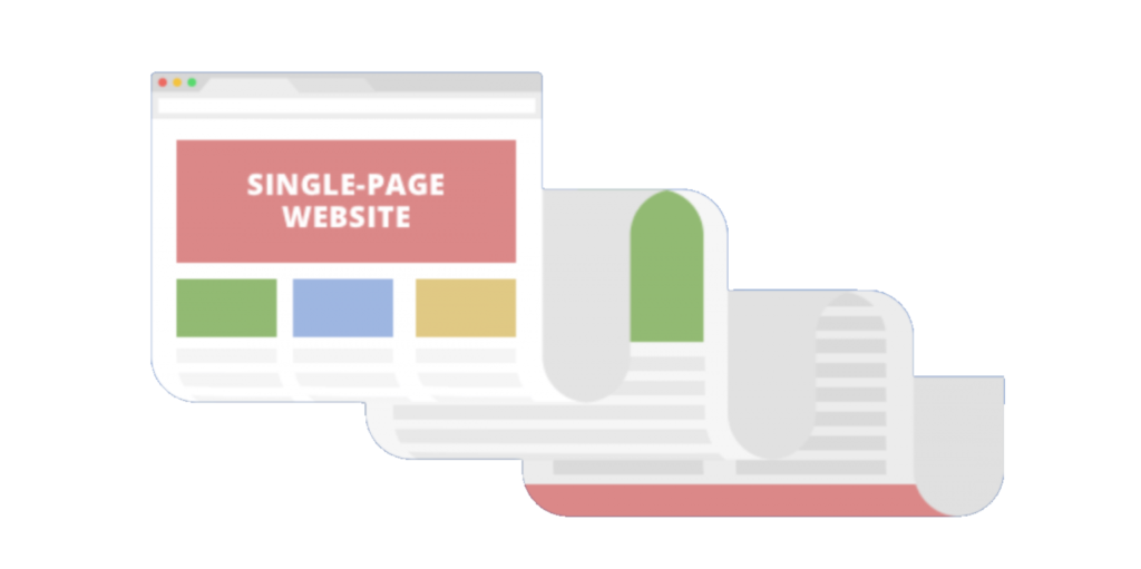
A one page scroller website controls the flow of information to the visitor, and is great if you don’t need a blog or additional pages.
One page websites have become quite a point of contention in today’s website building landscape. Hailed by some as the future of web design and derided by others as a metastatic blight on the face of the internet, the one page website certainly isn’t for everybody. It’s undeniable, however, that as mobile devices have become the primary means of accessing the internet, one page sites are able to uniquely fulfill newly-arising needs.


One page sites are generally ill-suited to large companies with varied interests, nor are they for those with a lot of information to convey. But if you have a specific focus and want to communicate a limited amount of information, the one pager has its advantages. One page sites essentially force the visitor to experience your content in linear fashion; they also narrow the range of choices the visitor can make, and that isn’t a bad thing. More choices require more time to process. In 2017, your visitors are likely to be distracted and pressured from all directions, making it less likely they’ll make it through the available choices. Accordingly, some studies have found single-page sites to have higher conversion rates than traditional multi-page sites.
Explore Our
One Page Website Design Advantages
One page sites are often designed to be visually complex and engage visitors in a unique way - with a singular call to action in mind. The visit becomes more of a journey instead of an unguided experience. Instead of simply perusing the content on each separate page, visitors have to scroll to move through the website. As website designers, we get creative and bring movement to the site by triggering images or text to slide in and out once the visitor scrolls to a certain point. Motion has meaning!
A one page website layout is great for brands that only need to share a little bit of content on each topic. A seven page website with only one paragraph of text on each page may look scant and underdone. In contrast, a site set up with seven paragraphs on one page gives a fuller impression.
Being able to incorporate a lot of visual content on your website is another advantage of the one page design. The layout lends itself to be image / video driven in order to keep visitors engaged while moving through the site.
With a growing number of people accessing websites from their mobile phones, we think with the visitor in mind. One page sites offer a simple and intuitive experience for users; all they have to do is scroll through a website without clicking around on a small screen to find the information they are searching for.


